Group Configuration
Group Configuration Page
This page allows you to create and edit group configurations and view real-time monitoring.
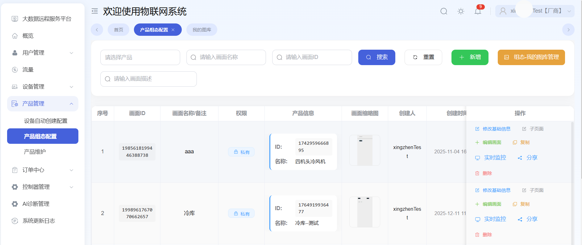
Create New Group
Two group types are supported: Product Group and Non-Product Group.
Product Group
Click Add, then select Product Group.
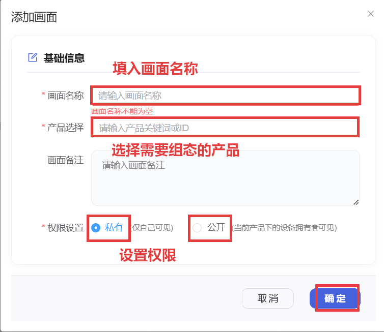
Add New Scene
After selecting the group type, enter the scene configuration page.
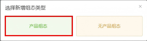
Non-Product Group
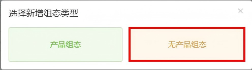
Click Add, then select Non-Product Group. Non-product groups can only be viewed on the desktop group dashboard configuration page.
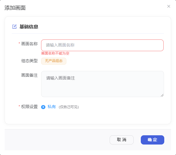
Non-Product Group Scene
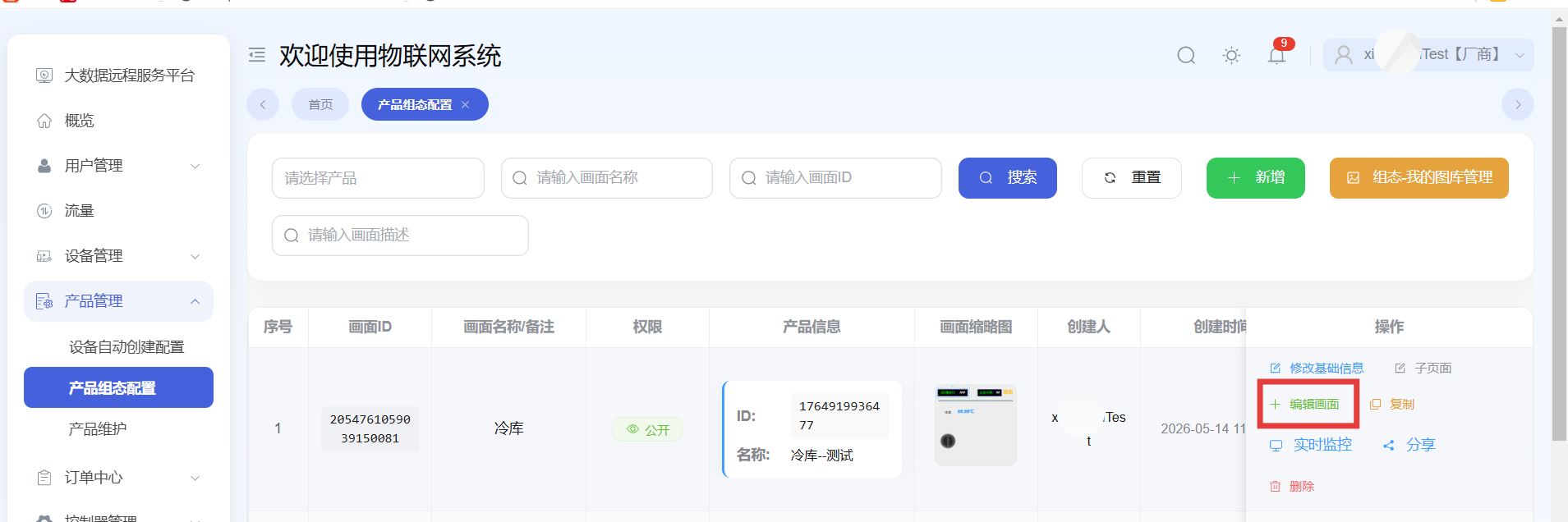
Enter the scene configuration page for the non-product group.
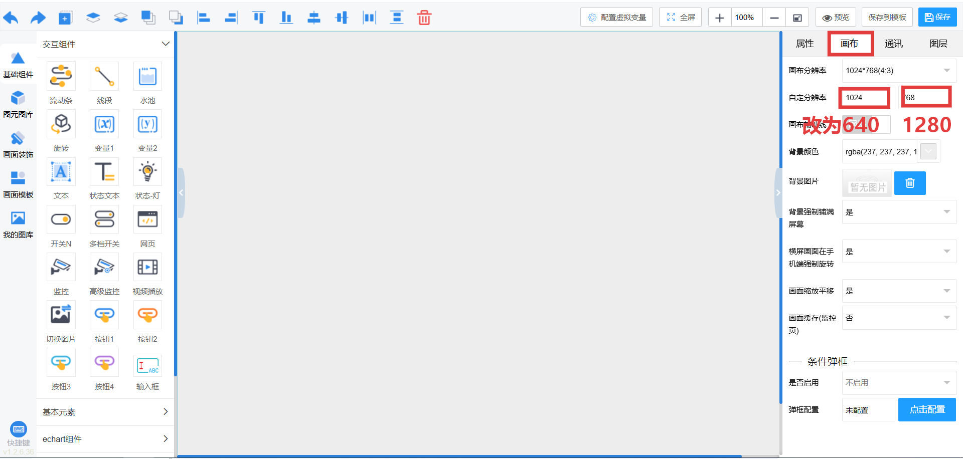
Edit Canvas
Modify the canvas resolution to fit the mobile interface. (If primarily viewed on desktop, select a resolution suitable for computers.)
Add Variables
Add variable controls in the group and bind device parameters.
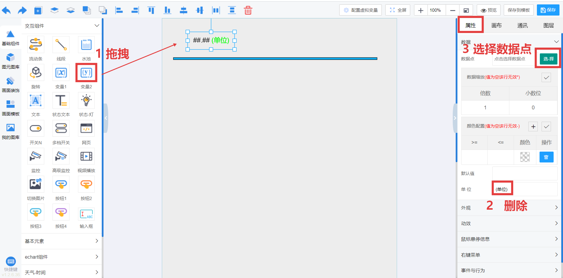
Select Variable Parameters
Select the device parameters to bind.
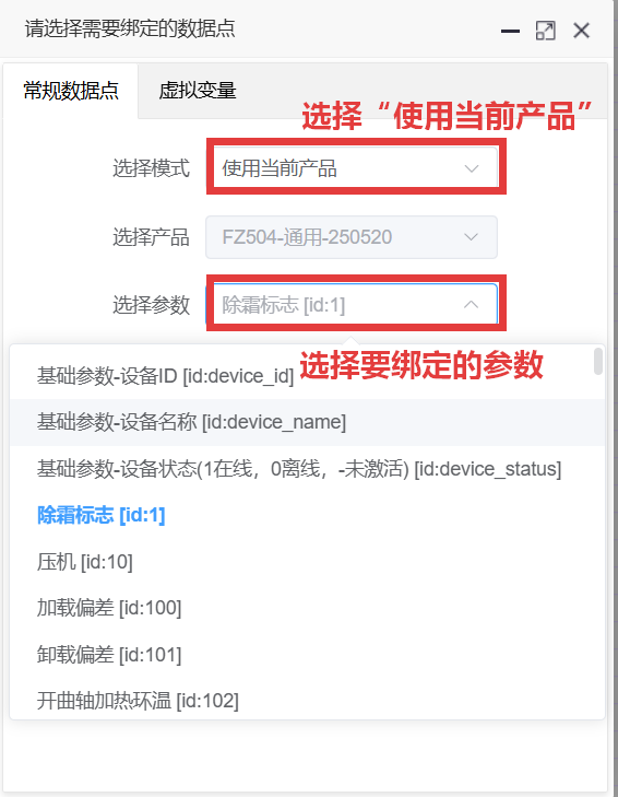
Variable Added
The result after adding a variable.
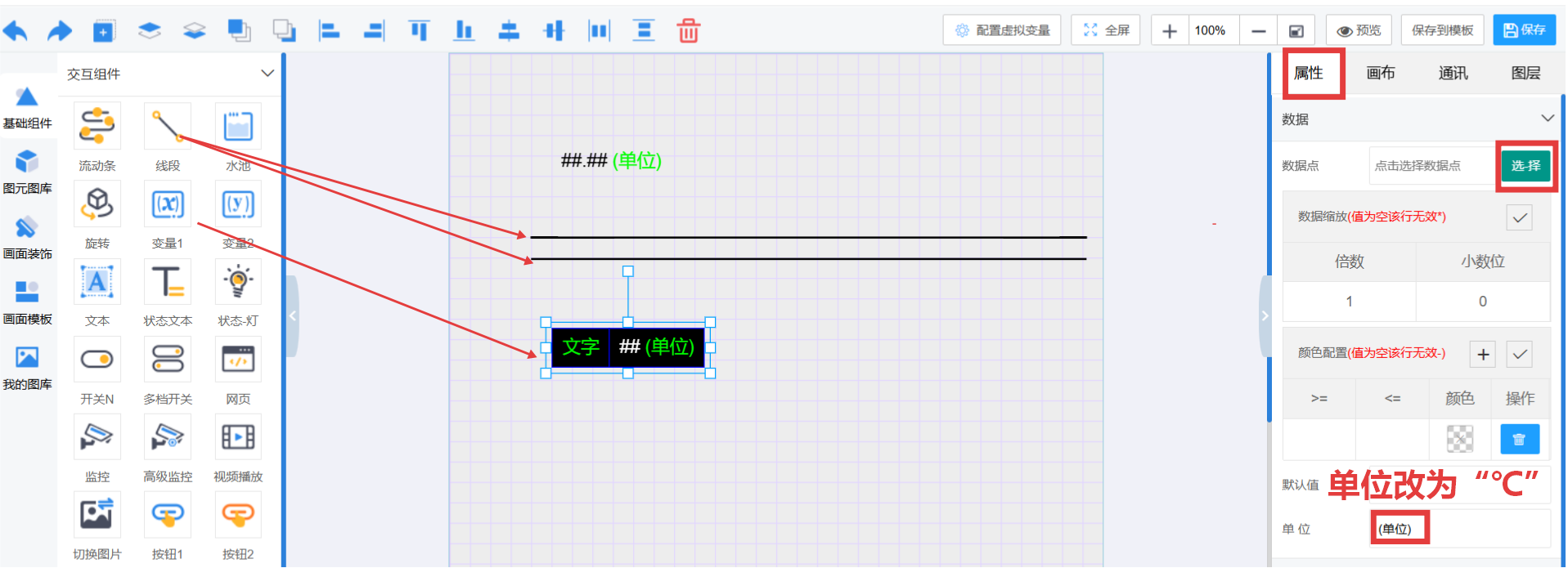
Edit Appearance
Edit the appearance style of controls. Remember to save.
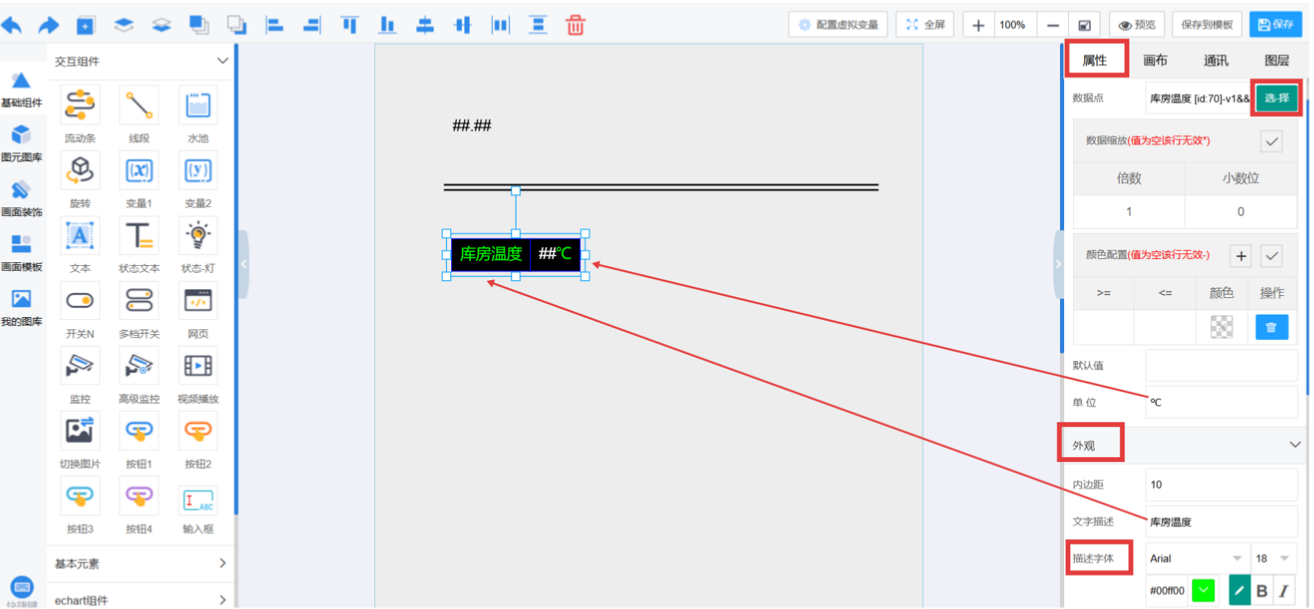
View Group in Browser
After editing the group, you can view real-time group monitoring on the web.
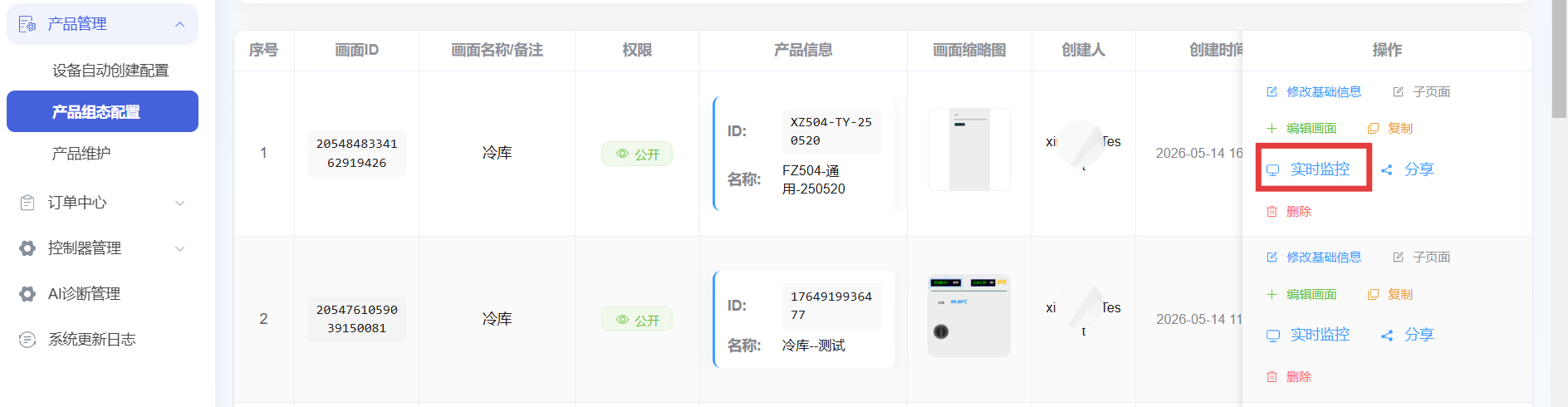
Jump to Real-time Monitoring
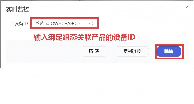
Click to jump to the detailed monitoring page.
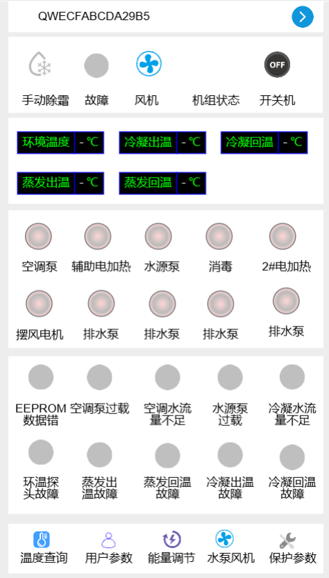
Desktop Group Effect
The display effect of the group on the desktop side.
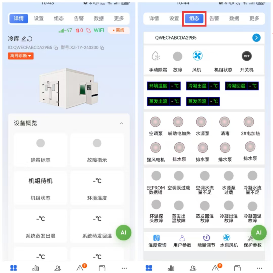
View Group in Mobile App
Groups support viewing real-time monitoring screens in the mobile app.
Add External Images
You can add external image resources in the group.
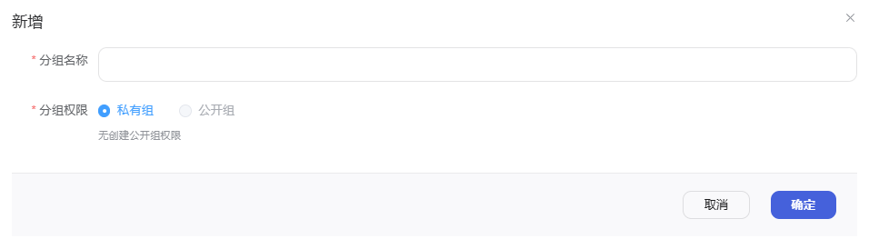
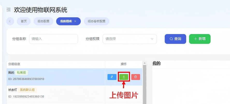
Image upload path: Device Management → Group Configuration → Group → My Gallery Management → Add
Upload Image
In the gallery management page, click the "Upload Image" button to upload image resources.
Group Screen Introduction
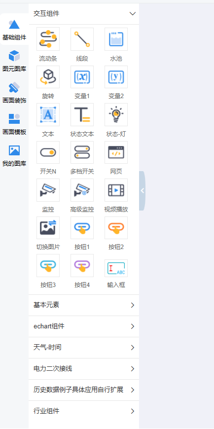
On the left side of the group screen are control icons, galleries, and decorations. If none are suitable, add them to the new gallery.
Right Side Properties Panel
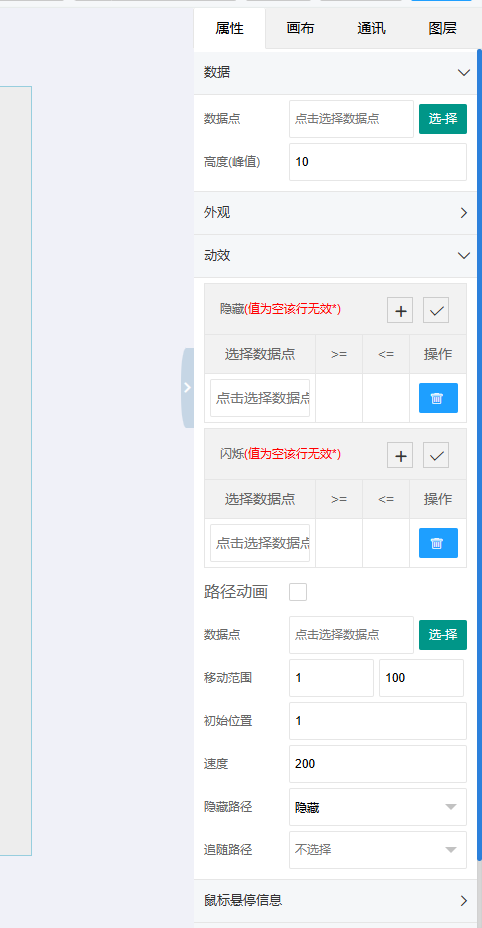
The right-side properties panel sets the functions of group controls.
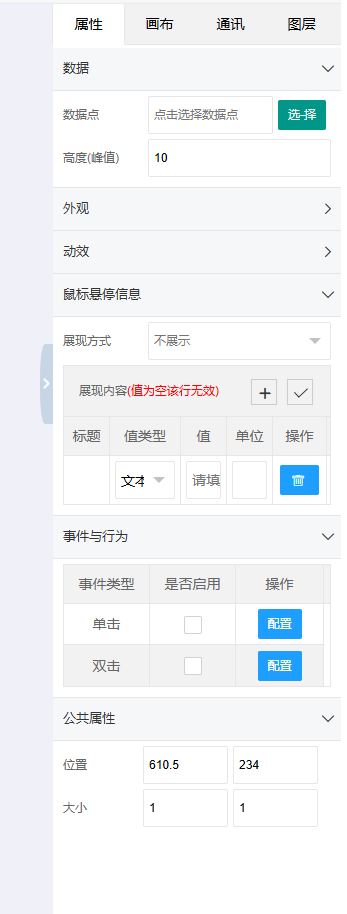
Data
Set the value or status of the control.
Appearance
Set the appearance style of the control.
Animation Effects
1. Hide
When the associated parameter is a specific value, the control is hidden — not visible on the interface, and clicking its empty position has no effect.
For example, in Mode A, controls b and c are disabled. Hiding controls b and c achieves the disabled effect.
2. Blink
When the selected parameter is a specific value, the control blinks.
3. Path Animation
When selected, the control moves from position 1 to position 2. Data points can be associated with relevant parameters to see parameter changes, such as capacity, height, depth, etc.
4. Events and Actions
Effects triggered when clicking (single-click or double-click) the control. Options include: open link, open group page, operate variable, show/hide, submit input box.
Control Quick Tools
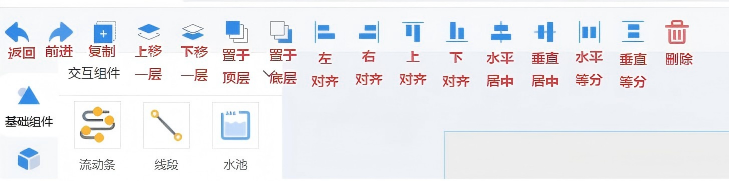
The group editor provides quick tools for efficient editing and operation.